The mobile era is here and design trends are stepping up when it comes to mobile UX.
If you want to reach a wider audience in a mobile connected world, then designing for a great mobile user experience is very important. Even if you created a website or app with mobile in mind three years ago, technology has surged ahead to improve on the mobile experience significantly and to account for changes in the mobile devices we have.
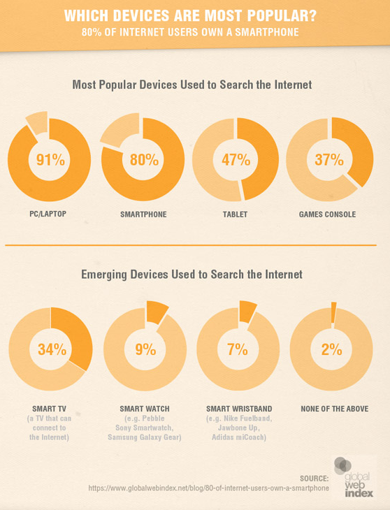
80% of the global population is using smartphones to surf the internet, while other mobile devices such as wearables are emerging in popularity. If you haven’t optimized design to accommodate this large section of the population, you’ll potentially be missing out.

Source: Smart Insights
Which trends should you be aware of? Let’s take a look at some which are emerging now:
#1. UX Simplified Design
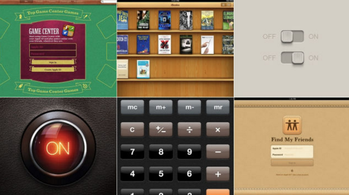
Since software updates in 2014, simplified, flat design has been replacing the skeuomorphic (items appearing as a likeness of how they are in the real world) designs of a few years ago. The flat design emphasises functionality and clarity, with minimalism and use of blank space highlighting and providing focus for functional elements.

Skeuomorphism examples. Source: Gizmodo
A lack of emphasis on those functions is the main criticism of earlier “1.0” versions of flat design. Where to tap or click was not immediately obvious to users of many apps which gave a more negative user experience. The preference in app design is always that even new users should be able to operate the app somewhat intuitively.
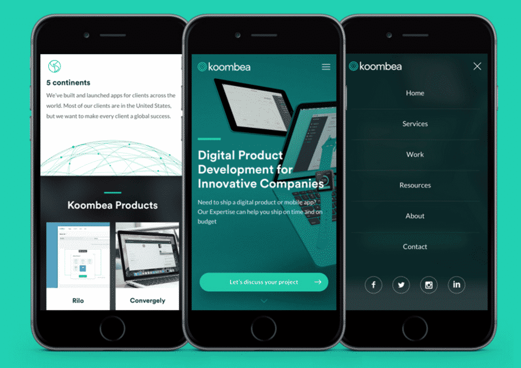
In our own recent redesign, we opted to go for a flatter, more simplified design. This type of design is more adaptable and suited to mobile, while flat design 2.0 still allows for some tasteful elements of skeuomorphism.
As The Next Web points out: “The principles behind this design technique are so universally — and aesthetically — pleasing that some of the biggest companies in the digital sphere, including Apple and Google, have adopted design frameworks with flat philosophies in mind.”

Our own redesign.
#2. Horizontal Scrolling
Horizontal scrolling was another feature we added in our own upgrades. Earlier vertical designs meant that we were limited in the information we could present on smaller screens as it wouldn’t render in a user-friendly way. Horizontal scrolling means we can display the same information for smaller screen users.
If we look back at earlier renderings of mobile apps, the pinch to zoom feature was a great start, but inconvenient and often frustrating to use in practice. Buttons were often too small to click on and navigation was cumbersome.
Horizontal scrolling goes with our more natural gesture of swiping to navigate. It also mimics what we would do in the real world to organize or read documents, following principles Google presented on material design.
#3. Navigation and Menus
We’re seeing navigation become more creative in apps as developers work to make the experience as clear as possible. For example, you might see parallax scrolling (where a background image remains static), modular scrolling (content-heavy apps allow users to scroll through columns of information) and hidden navigation.
The latter is where app navigation will display on screen for a limited period of time, then disappear when no action is taken.
What’s the point of that? Well for one thing, it gives you more “real estate” available on a small screen to render a good view of your app. If your app happens to have a lot of content, hidden navigation helps to provide a clearer interface.
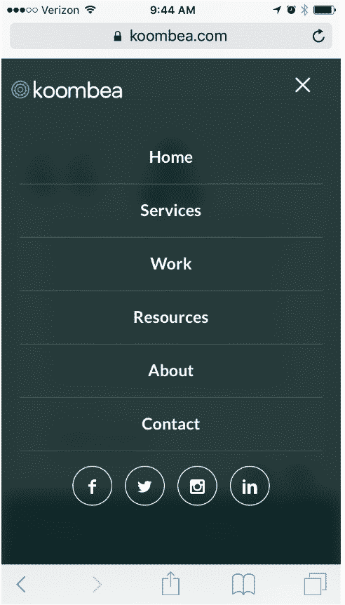
When we redesigned our site, we went for the full-width “hamburger” menu, which is still a popular design choice. This allows us to display our most important web pages clearly on any device.

#4. UI for Touch Gestures
With each new iOS update, it seems we get more options available for how gestures work in apps. What do we mean by “gestures?” Here’s Google’s explanation:
“Gestures include touch mechanics (what your fingers do on the screen) and touch activities (results of specific gestures).”
Each touch mechanic is associated with a touch activity, for example tapping once on an app will open it, but on an iPhone, a “long press” of any app will select all apps so that you can move them around and change the order of how they appear on your phone.
There are many other possible gestures available (two-finger double-tap, pinch open or closed, long press and drag …), but remember that goal of user-friendliness and intuitive operation of apps. With the increasing number of smartphone users in the world, designers are looking for ways to take out any clunky gestural requirements (for example, having to shake the phone) and go for the obvious instead. Tapping or swiping are much simpler gestures which most people, even complete smartphone novices, will be able to pick up quickly.
Let’s not forget 3D Touch either. This is still relatively new in terms of apps being developed to take full advantage of it, but it’s another way to provide a better UX design. As this CNet article infers, 3D Touch is still very much in its infancy, with many users still defaulting to how they would have previously used their iPhones. This is definitely an area to keep an eye on moving forward.
#5. Split Screen Multitasking
Multi-taskers rejoice; both Apple and Android have come up with split screen multitasking, where you can have multiple apps open and usable on your tablet screen. The convenience won’t be lost on those who have ever sat there trying to flick from one app to the next to gather information.
For example, you could be responding to an email with your inbox app open, while looking up details you need for the email response in another app, viewable at the same time.
The challenge for UX is that you should now be mindful of this in your app development. If you want to reach those multi-taskers with your app, then enabling the app to work with split screen multitasking is a must.
Applause had this to say for Apple app developers: “The primary concern for iOS developers and designers is that Apple is changing the dimensions of their apps on the iPad in such a way as they will not fit or look right.”
As for Android, they have enabled split screen multitasking more recently than Apple, though as pointed out by Arstechnica, Android apps have had resolution independence (where the app will resolve to suit the screen) built into them for longer than Apple apps have. This means most will probably support split screen already, though any apps which run in fullscreen mode won’t.
Whether or not your app is going to support split screen multitasking is definitely another feature you should consider.
#6. Motion Animation
“Animation is no longer a novelty for web designers…it’s becoming the basis of effective interaction design.” Web Designer Depot
When you walk into a bricks and mortar store and are interested in purchasing a product, what do you usually do with it? You probably pick it up, turn it over and examine different angles of it to determine if you are indeed making the right choice.
Now imagine you can almost do the same thing on an ecommerce mobile app. Sure, you can’t physically touch the product, but motion animation technology allows you to use a gesture command which will turn an animation of the product around, giving you those views of different angles.
Besides allowing users to move pictures around, motion animation is becoming more popular in mobile apps as a device to highlight important aspects and to generally provide a better experience for users.
#7. Subdued Color Contrast
Both color contrast and typography are seeing a shift toward cleaner, more subdued palettes. Previously, conventional “wisdom” believed that starker color contrasts made screens easier to read, but in fact the more subtle colors are easier on eyes and therefore provide a better user experience of the app.
The same goes for font use. A more minimalist approach is being taken to ensure that typography resolves better on different screen sizes. Sans serif fonts are one of those which are legible at different resolutions, one reason why we used Circular Std in our own recent upgrade.
Another point to consider here is that, of the ever-growing population using mobile, 4.5% are color blind, or 8% of all males. Smashing Magazine wrote an excellent piece recently on design for color blind users, many concepts of which fit with the new, more subdued contrasts. If, for example your audience is mostly male, this could impact a significant proportion of them.
What’s Next?
There is no end in sight for the incredible growth of mobile use, so increasingly, UX design is improving with native mobile use in mind.
Many of these updates mentioned are still in their infancy, so expect to see further development of features such as 3D Touch, split screen multitasking or motion animation.
We predict that some of the most exciting app developments will be focused around mobile!
Is your app equipped to best take advantage of new UX trends? Talk to Koombea today about how we can help with your design needs.
