What makes an app successful and engaging for users?
You’ll probably have a few different thoughts on that question, depending on the type of app you’re thinking of, but one aspect that is universal across apps is designing a great user experience (UX).
A core part of UX is focusing your app content so that the right things are shown in the right places at the right time for your users. You’ve got to be able to make the distinctions between what is important and what may be secondary.
How do you decide which content to feature? Here are a few thoughts from us:
Understand Your User’s Priorities
User experience is, of course, first and foremost about the user. This means that you need to be primarily prioritizing your content based on what the most important things for the user will be.
It follows from this that you, therefore, need to understand what those priorities might be — how will you know? To start with, we’d look at the primary problem or problems your app is solving and start from there. It makes sense that any “big win” features for solving the main problems should be prominent in your UX design.
Secondly, ask your users! Run beta testing and gather feedback before releasing your app, but also remember to survey users once your app is released. Have you still got the priorities right?
Consider Screen Size
You might have an idea of what the most important things will be to feature already, but have you considered how you’re going to render them for a good user experience across different screen sizes or devices?
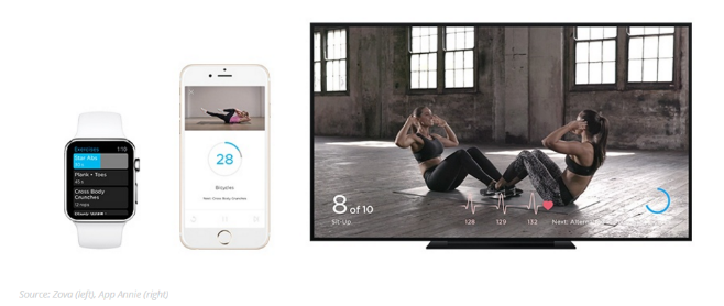
For example, Branding Brand looked at an Apple app which has won an award for design, fitness app Zova. They understand that the top three things a user needs to know while exercising with the app are current exercise, total reps or time and reps or time remaining. They’re also very good at sticking to this while providing an experience that is appropriate to the individual device, whether that be an Apple Watch, iPhone or Apple TV.
Apple Watch shows a minimal display while keeping those key priorities front and center and rendered appropriately for the small screen. The iPhone app brings in a bit more detail, including video of the exercise and different displays for vertical or horizontal viewing. The Apple TV screen, of course, provides much more room for details and takes advantage by showing the exercise, with overlays for timing and reps on the full screen.

Be Logical
Here’s some advice directly from the guidelines for material design:
“Organize your app’s structure according to the content and tasks you want users to see. Focus attention on important destinations by displaying them in tabs or in the side navigation, and de-emphasize inessential content by displaying it in less prominent locations.”
One of the big mistakes we see in apps is where the content is not organized in a logical manner. It becomes a confusing mishmash for users who will probably give up in frustration. Information presented to the user should always be provided in a way that is easy to understand and in just the right amount. It’s about finding that balance of not too little, nor too much, as with one they probably won’t know what’s going on at all and with the other, they’ll probably feel overwhelmed with information.
You can always take users through a stepped approach with your navigation or in-app prompts but avoid the temptation to try and clutter up the screen with too much at once. “Too much” might include unnecessary animations, use of too many words, icons all over the place or even not enough white space allowed. You should also consider how your content choices affect accessibility for your app.
Try to Reduce the Number of Actions Needed
Just like how users of a website prefer not to click around looking for things or in order to achieve a task, users of an app would prefer fewer clicks or gestures required for the important things. In short, they just want to reduce the time it takes to get things done.
When considering how you’d prioritize content in order to reduce the number of actions required, there are a couple of other issues for you to note. Firstly, it’s always best practice to use a UI pattern which your users are likely to be used to already. For example, there are a number of known, common gestures for using an iPhone app, but there are plenty more which you could use but are not so common. Where possible, stick with regular gestures like tapping or swiping.
Secondly, think about how you will set up your navigation and menu for your app. What will your users understand and appreciate? There is no sense in using an obscure icon menu when no one understands what it means, for example. As iOS say in their “Human Interface Guidelines”:
“People tend to be unaware of an app’s navigation until it doesn’t meet their expectations. Your job is to implement navigation in a way that supports the structure and purpose of your app without calling attention to itself.”
Consider Personalizing the Content
Some of the most popular apps are improving the user experience by getting personal. We don’t mean just by firing out messages that say “Hi [UserName]” either. They consider user preference based on their behaviors and prioritize the content they show based on this.
Airbnb is a good example. Say you have a trip booked to stay in New Orleans for the weekend, one of the first things you will see when opening up the app is a guide to New Orleans. You’ll also see recommendations under “just for the weekend” for sites or activities you might like to partake in.
There are other travel apps which are also a good example of personalizing content. Over time they learn the preferences of users and present them with information based on those behaviors.
Another example of personalized content is an app which shows recommendations based on past purchases or behaviors. Amazon is one. If you open up the app you will be presented with “your recommendations” based on what you have previously purchased.

What About Offline Content?
Will your app still be useful if the user has no internet connection or has to switch to airplane mode? This is another consideration for focusing on content. Most apps are rendered useless by either of these situations, yet the user may still have a use for the content (to check a booking, just as one example).
This means you should consider how they are going to access the content they need so that it renders usefully offline. For example, you don’t want them navigating through features which will need a data connection to load.
Speaking of loading, add this as a consideration for organizing your content. Excessive load times turn users away so you don’t want features such as heavy imagery slowing down the user experience.
Have You Focused Your Content?
The user experience is one of the primary drivers of whether or not your app will do well. Keeping the content well-focused is an important part of that user experience.
When designing the user experience, you should keep user priorities front and center as the main drivers of how your content will be laid out. It should be logical and should address user needs as efficiently as possible.
Avoid any temptation to throw too much content into one cluttered space and consider the device for which the app needs to render. Designing for simplicity and usability will usually provide a winner.
Koombea helps you to create useful, focused apps. Talk to us today about how we can help you.
