You can have the best idea possible for a SaaS product, but if you don’t have good strategies for UI and UX, then you’ll only churn customers.
UI (user interface) and UX (user experience) are inextricably linked – a poorly executed UI can make for a bad UX, while a bad UX can override a good UI in the mind of the customer.
User Interface Design complements User Experience by taking care of the look, feel and interactivity of your SaaS. User Experience is the collective areas which focus on giving the customer a good experience. For example, customer service isn’t part of your UI design, but it’s definitely part of UX.
With that being said, there are often trends that come and go for UX and UI design, but what makes for best practices? Let’s take a look:
#1. Use simple icons
Icons have an important job to do – they help to show people where to go and what to expect when they get there. However, one thing we have seen pop up with some frequency is SaaS and other apps that use icons which virtually no one understands.
If someone needs to click around, or needs some kind of “icon dictionary” to understand what you mean, then that icon is a poor choice.
“Simple and practical” should be the mantra here. Your users want to understand within seconds what the icon means and what it is used for. Ideally, it is widely recognized and clearly represents the function for which it stands.
#2. Dynamic data sorting
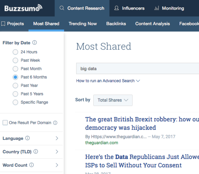
There are many SaaS apps which involve data in various forms. For example, Buzzsumo allows users to search shared content and popular authors. Where your app involves searching for and sorting through a lot of data, then dynamic sorting options are a best practice that will improve user experience.
This means having appropriate ways to limit and filter search data so that the user can pick what is most relevant to them.

#3. Create logical pathways
Onboarding and getting users set up to successfully achieve what they’d like to do with your app is a big deal. You need to provide enough upfront that a user can clearly see how they will derive value from your app, but not so much that the user is overwhelmed. You also need to be careful that when you’re limiting upfront information, it is as relevant as possible for your target users.
We see some SaaS make the mistake of requiring the user to enter information or go through a step that isn’t relevant to them at all. If there is no option to skip the step, then that user will probably disappear.
Another mistake is to neglect to design the pathway through the app in a logical way. You could look at it like a series of doors. The user gets to pick a door when they enter, which may lead to more doors, however, no matter which way they go, the pathway should be clear and logical. Users’ experience is impacted when they go through door C expecting to get option A, but end up with option Z instead.
#4. Customization
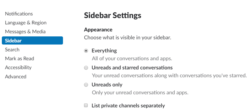
The ability to customize the appearance of the app to suit the user’s own work habits can be a great way to engage them if it is possible to do. For example, apps like Trello allow users to set up their own preferences and create flows to suit themselves.
Slack is another example of a SaaS which allows users to customize their appearance and preferences. When a user is able to mold an app to fit their business practices or workflow, there’s a better chance they’ll adopt it going forward.

#5. Global navigation
Following on from the point about creating logical pathways, having very clear global navigation to begin with is an important practice to adhere to. For larger SaaS, you may have many links, tools or features available, so a global navigation menu is vital. This can be challenging to manage, especially if you have a large number of features to include – good examples to look at include Hootsuite, who have a list of menu icons in view at all times.
The other option is that those items are somehow hidden in other areas, but this is not a great experience for the user. No one likes to have to dig around looking for that one particular feature they wanted to use.
#6. Frictionless signup
No one is going to jump through hoops to sign up with your SaaS. There are a number of examples of potential “friction” at signup, including:
- Excessive form fields – ask only for what is absolutely necessary.
- Requiring a credit card for a free trial.
- Not having clear calls to action.
People want to know exactly what they’re signing up for and why. They also want to see a clear path for doing so. For example, you’ll sometimes see vague CTAs with no context around them, such as “yes, give me access!” Access to what? For how long? Do I need to pay right now? Make sure all key information is abundantly clear.
#7. Have a beautiful design
Your UI needs to be as simple and functional as possible, sure, but we’re past the days when that meant design could be rudimentary. Now, something that is beautiful to look at is commonly used to help direct a user’s experience.
Take for example apps like Airbnb or Asana – their aesthetic is part of their appeal. Users tend to be quite vocal about the UI as it can provide a positive or negative experience. Look at Snapchat’s interface change earlier this year, users almost universally vilified the app for making their experience more difficult.
#8. Make it easy to get help
Ease of use is the aim of the game, and that includes making it easy to get help if necessary. This means not only making how to get help obvious, but including options to get it that your customers want to have.
For many SaaS, this will involve a combination of options; instant chat, support desks, help tickets, knowledge bases, and quick start guides. You can also improve the process by staying in regular communication with users and keeping them informed about any changes. Ideally, you should have a combination of self-service and supported help options.
Final thoughts
SaaS UI and UX are vitally important aspects to get right if you want to engage with and keep users. A poor UI will impact your UX, while even an excellent UI can’t make up for an overall bad UX.
The SaaS world tends to go through many trends, but the best practices we have mentioned are enduring items that are unlikely to change much. The overarching idea is to reduce friction for users in any way possible and ensure that you have catered directly to their needs.
Koombea helps companies create beautiful, yet highly functional SaaS apps. Talk to us about how we can help you today.
