Data is everywhere, and it is helping us change the world. Good quality data can help us spot trends, make better decisions, and understand processes. To do so, it is necessary to use good quality data visualizations.
Thanks to data’s potential and versatility, some of the world’s best apps are making smart use of it to build incredible user experiences through amazing visualizations. What most app teams don’t understand is that there is more to crafting an excellent data visualization experience than just adding a nice graph.
People usually think of User Experience (UX) and Data Visualization as two completely different things, even though they are strongly related. The first belongs to the domain of designers and the latter to the fields of data science, but in the end, they both converge in their purposes: delighting users. In this post we discuss some advice and strategies for app development teams to determine what your app users want in terms of UX Data Visualization.
Why UX Data Visualization Matters
One thing about data is that it is of no use if users can’t make sense of it. If your app relies heavily on data visualizations, it is important to make sure that they align with your app’s UX strategy.
The process of helping users visualize data requires a blend of data science and design skills. By combining these skills, app development teams can deliver results that engage users. It is all about building an appealing portrayal of information to which users are attracted. In other words, data visualizations need to consider what is the best way to communicate information to users.
This sounds like something trivial, but it can make an important difference in terms of your app’s engagement. Users will most likely prefer an app with friendly visualizations than one where it is hard to interpret the data. If you can’t get your message through, then you are not achieving your goal. In case you are not convinced, maybe this video on the beauty of data visualization by David McCandless, a guru on the subject, can change your mind.

Tell a Story with Data
The concept of storytelling has gained relevance in recent years. It basically highlights the importance of telling a coherent, easy to follow, and interesting story to your audience. For this, it is important to understand who you are speaking to and what message you are trying to communicate.
Complicated narratives only tend to confuse your audience, and that’s something you surely want to avoid. Having a well-defined communication strategy is necessary to prevent the risk of being unclear.
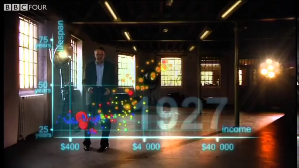
Data is not an exemption when it comes to storytelling. Some of the greatest stories use data to communicate a message. Look for example at the work of the late Hans Rosling. He was a pioneer in using technology to visualize data and extract meaningful information from it.
Your app can benefit from portraying data in ways that are easy for users to understand. Users may not notice the hard work your team puts on delivering great data visualizations, but they will surely notice when the information is hard to grasp.
4 UX Data Visualization Tips
From our experience, great data visualizations have some elements in common. Try to keep this in mind when designing your app’s UX Data Visualization strategy and you will be able to build great stories with your data that users will love.
- Data visualization isn’t just about how nice the data looks. Above all, it is about conveying meaning and a clear message. Understanding your users can help you figure out how they think and interpret the world.
- Communicating an idea through visualizations is not only about graphs and tables. There are other more subtle and useful ways in which data can be communicated. Think, for example, of some of the visualizations found in Flourish.
- Testing your visualizations is the best way to find out if they really work. Only by doing so will you be able to make sure if the message is getting through.
- Building visualizations that users love is both a science and an art. Doing so requires a certain level of technical knowledge on how to handle the data, and it also demands being savvy in the fundamentals of design.
The specifics of each case may vary depending on many aspects of your app. Try always to be congruent with your brand. That will help users make sense of the message.
Seek for Advice
Building great UX Data Visualizations for your app can be hard. Testing them once your app has reached the market can help your app improve, but this strategy has its costs. Users may easily become disenchanted with your app and as a result, they may delete it. To avoid this, it is best to work with someone who has experience delivering engaging visualizations.
Many of our clients at Koombea request that their in-app data be displayed in an engaging way. Thanks to our more than 12 years of experience using UX design principles, we understand how to merge your app’s needs, your brand, and what your users need to portray your data accordingly.
Contact us for a free consultation and learn more about how Koombea can help you build engaging UX driven data visualizations.